Spotted: 6 retailers using dark UX patterns over Black Friday and Cyber Monday
3 minute read
Over the past couple of years, we’ve been on the lookout for how persuasive design has been implemented, around Black Friday and Cyber Monday. Nexer's initial research on this found a good few retailers using design principles to ‘trick’ people into spending more online. To an extent, this is somewhat unsurprising. The latest figures for 2018 research suggest that these annual sales frenzies are worth a combined total of £7 billion to the retail sector.
And 2018 proved no different, in terms of some retailers using #DarkUX strategies to boost their sales figures. Here are the 6 that we spotted:
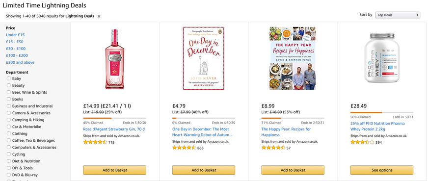
Amazon
Regrettably, they have been in our findings for the past two years. Firstly, there were offering in-demand electrical products, with no discernible discount when compared to other retailers. For example, a phone in Curry’s retailed for £779 without a discount, while Amazon claimed the same device was £779 reduced from £999.
Amazon’s ‘lightning deals’ – or limited offers - also help to create a fear of losing out on a deal by making them extremely time-sensitive.
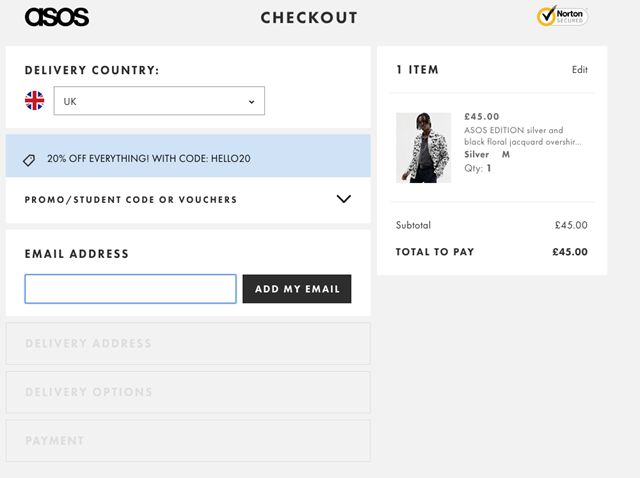
ASOS
ASOS was offering a ‘Black Friday’ discount of 20% - but only if you enter a promotional code. However, the ‘enter code’ box wasn’t in an obvious place during the checkout process. The brand is promising customers a discount, but not reminding them they can use it.
Jacamo
Similarly, Jacamo was offering a ‘code only’ Black Friday offer, which was difficult to see on the home screen. Furthermore, during the checkout process, the ‘enter code’ form only appeared on the basket page after signing in. Yet, if you signed up as a new user, you were taken straight to the checkout page, bypassing the discount code option. Consequently, new users had to put in extra effort to get their discount.
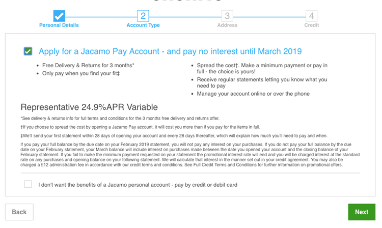
During the registration process, one of the ‘sign up’ buttons actually added shoppers to the company’s mailing list. Moreover, during registration the form pre-selected an opt-in – for a ‘Jacamo Pay’ credit account.
Very.com
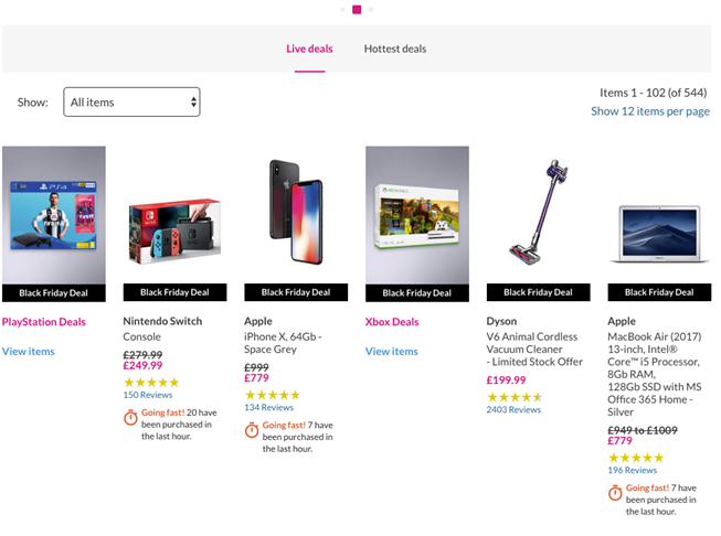
We also found that lifestyle retailer Very.com may have been encouraging ‘pressure’ sales. By stating that particular sales items are ‘Going fast!’ with ‘7 purchased in the last hour,’ shoppers may feel that they should buy immediately, or face the disappointment of the items selling out.
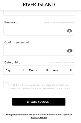
River Island
River Island was shown to be prioritising data collection over its customers’ privacy, with a near-invisible ‘opt-out’ tick box at checkout stage. Not only does this potentially confuse shoppers, but it doesn’t meet recognised best-practice accessibility guidelines on colour contrast.
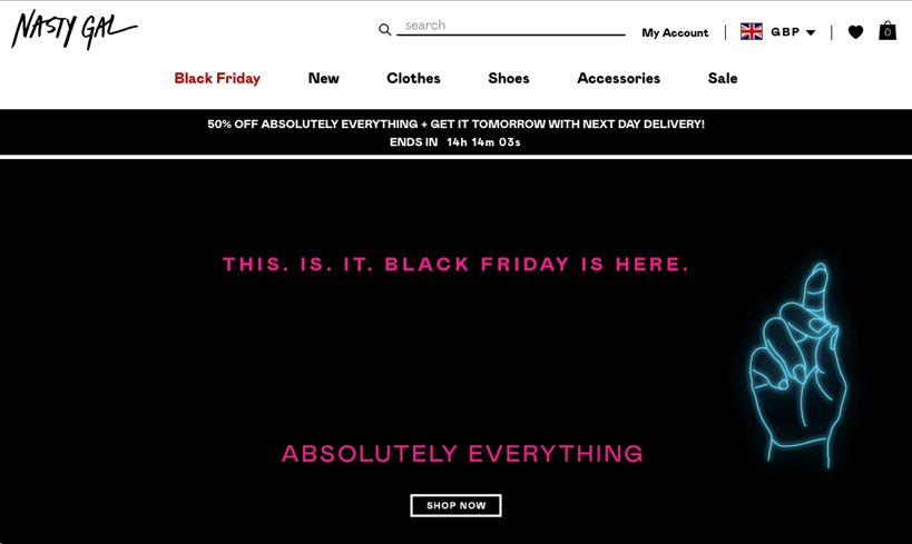
NastyGal
We saw them playing on shoppers’ ‘fear of missing out’ by urging them to complete purchases, before a ‘limited’ delivery offer is no longer available. However, it is unclear whether the offer is genuinely limited. Shoppers may once again feel compelled to buy an item at that moment, instead of taking time to reflect on whether it is what they really want or need.
Always read the small print…
The examples listed above are just a brief overview of what we know is happening across the entire retail industry, when websites are designed with ‘mind tricks’ to confuse consumers into making a purchase.
These strategies take advantage of customer desires to find a bargain on Black Friday and Cyber Monday. For exactly this reason, they are likely to have been deliberately implemented.
Perhaps the most worrying finding within this year’s Black Friday research was that customers are automatically being signed up to credit accounts which, in the wrong hands, could create unexpected personal debt.
We advise shoppers to take care when it comes to ‘sales’ events, as – evidently – they can be rife with ‘dark user experience’ practices. Always read the small print (even if it might not be immediately obvious where that is!).