Testing Accessibility on Mobile Devices – Part 1: Automated testing

Practice Lead, Quality
3 minute read
As designers, developers, UXers, technologists and everything in between, it is our responsibility to ensure that everything we design and make is accessible to everyone, regardless of their visual, auditory, cognitive or physical abilities. This is no less the case when designing for mobile, but mobile accessibility testing has a few quirks of its own.
In this series of three blog posts, we’ve compiled a list of our most trusted and commonly-used approaches for carrying out accessibility testing on mobile devices. I'll cover three approaches to accessibility testing: automated testing, testing using a screen reader, and manual testing. As you'll see, we recommend you use all three of these approaches in your own testing. This week, we’ll cover automated testing.
Automated accessibility testing
Automated testing is never enough, but it is a useful first step for flushing out a range of issues.
Firstly, to run automated tests on mobile you’ll need a user agent, especially if the site is adaptive rather than responsive. It doesn’t really matter that the site may look and behave slightly differently than on an actual device: the agent makes sure the code you are testing is the code that will be served to the device you care about.
We use User-Agent Switcher for Chrome which makes it quick to mimic different browsers and phones.
After mimicking a mobile device using a user agent, use automated testing tools such as Wave, which can be downloaded as a Chrome extension.
Wave tests several accessibility issues including:
- Colour contrast issues
- Missing alternative text
- Missing form labels
- Fieldsets and legends
- Heading level structures
- Empty links and buttons
- Missing document language
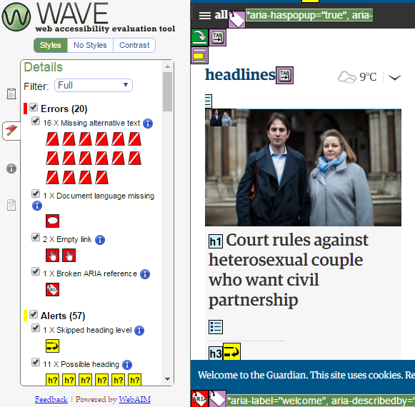
Wave shows several accessibility issues on The Guardian website include missing alternative text, missing document language and a broken ARIA reference.
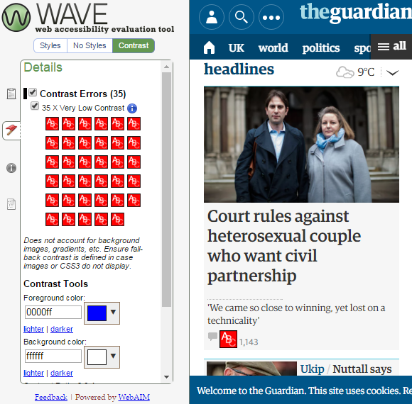
Wave also shows several colour contrast issues on The Guardian site, particularly around the pale grey text.
I particularly like Wave’s visual approach: issues are highlighted on the page so I can immediately see where they are. If I need to look into the code if something isn’t clear - e.g. empty links – I can do that in the same view.
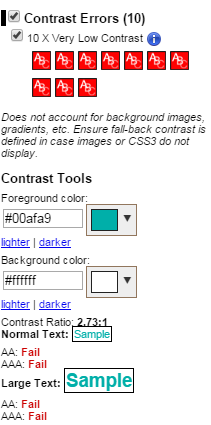
Wave also provides useful explanations. When I click on an issue, I can see what the problem is, why it’s important, and a general recommendation on how to fix it. For example, if there is insufficient colour contrast, Wave shows me where the problem is, explains that it is important for users with low vision and tells me that the contrast levels need to be 4.5:1, or 3:1 for large text (over 18 point, or 14 point bold).
A word of caution: most automated testing tools focus on particular elements, so I always back up a Wave test with another tool such as SiteImprove or axe DevTools for extra coverage.
That’s all for automated testing, the mobile accessibility blog series continues with screen reader testing and manual testing.